
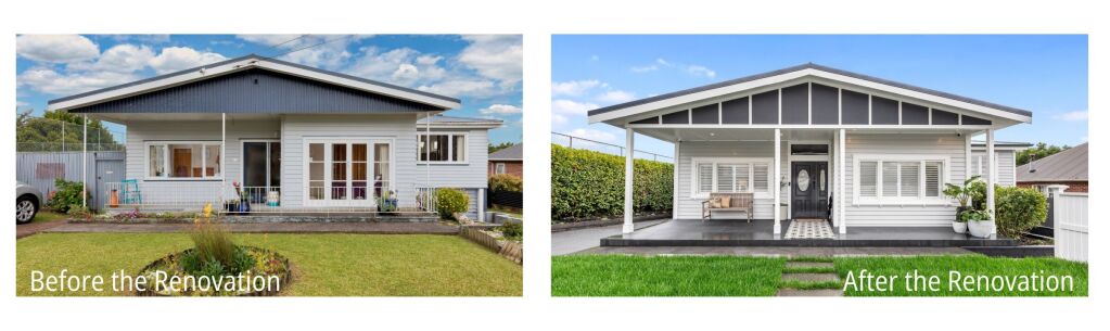
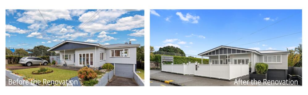
Case Study: Bringing Back the Heart of a Mt Albert Bungalow
What Didn't Work With The Home?
When Paul and Kate spotted this home on Trade Me, they were instantly drawn to its location, community, and potential. Marketed as an entry-level “do-up,” it came with an outdated, complicated layout — dark, damp, disconnected, and undeniably tired.
The original Floor Plan
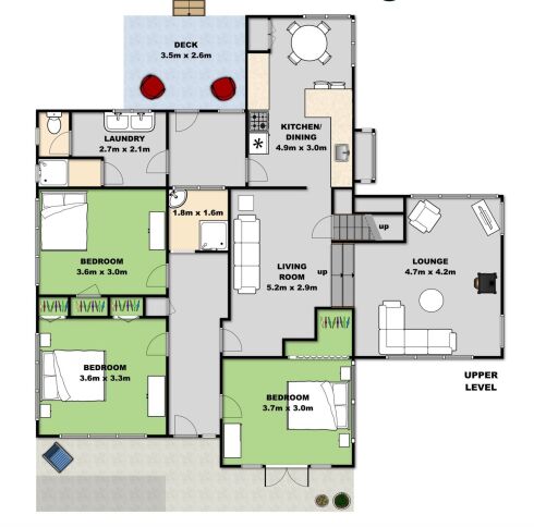
The original floor plan revealed just how disjointed things were: a closed-off kitchen leading to a makeshift deck “landing pad,” a bach-style bathroom, and a layout that simply didn’t flow.
Living in the home for two years gave Paul and Kate a clear sense of what wasn’t working and what the home could become.
With Alpha 1's Align, Design, Renovate process, they took the project all the way from concept design through to council approval.
This streamlined approach allowed the home to be reimagined as a connected, character-filled four-bedroom family haven, while Kate's interior design thoughtfully shaped the interior feel.
A key move was transforming the awkward 70s split-level addition over the garage into a serene parents’ retreat complete with master bedroom, en-suite, and walk-through wardrobe.
The split floor plan that was...
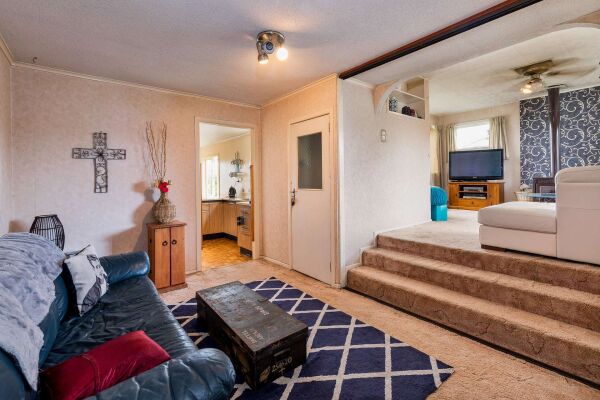 Here you can see the split-level nature of the layout. With a tiny entrance to the original kitchen. You can also see the draughty internal entry door to the garage below.
It certainly proved to be a challenge when trying to reconfigure the main living spaces. Making the kitchen feel very disconnected from the social spaces and the garden. The original lounge area you see here was a strange kind of landing space off the front hallway.
The bathroom was directly across from the front door. Not ideal...
The ceilings had been lowered and covered in unattractive ceiling tiles; the home needed vision and heart. And that’s exactly where the transformation began.
How the issues were remedied with a new floor plan.
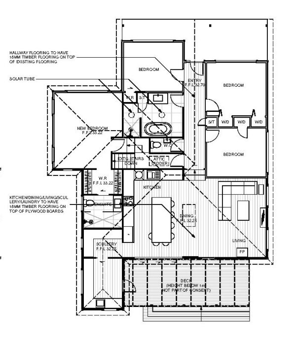
Here is a revised concept floor plan. This now includes an extension and the reconfiguration of the original layout. Allowing for much better flow and use of the floor plan.
A practical family bathroom off the main hallway, an open-plan kitchen/living and dining that leads straight out to a covered deck. Just perfect for entertaining and bringing nature inside.
A separate WC for the three kids was also on the wishlist, along with lots of storage everywhere....The electrics were very old, so were completely replaced, repositioned and upgraded thanks to our trusted Electricians at Strike Electrical
The home was extended by around 1/3 to provide the extra space the family craved after welcoming baby number 3 and to achieve the optimum layout for the home and the section.
What didn't work in the original kitchen?
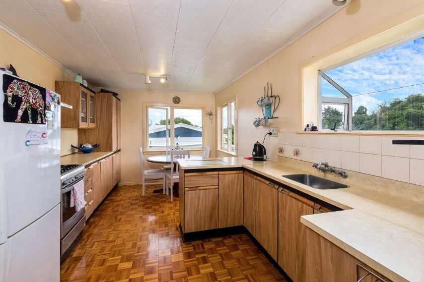
The original kitchen was pokey, lacking in storage, bench space, and so outdated. Featuring several 'fake timber' finishes.
It was also disconnected from the garden. Needing to funnel through a tacked-on porch, which housed the original laundry and bathroom/toilet. Especially cold on winter nights, and not ideal for two young kids to navigate.
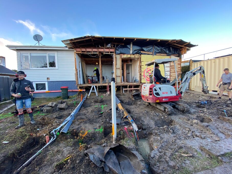
Demolition and set out for the new foundations.
Here, you can see that the back of the home has been demolished and opened up. With a digger onsite to remove the dirt, as well as setting up the post holes for the new extension and deck off the back of the home.
The new kitchen/dining is taking shape

In this shot, you can see that the subfloor for the new extension has been built. You will also see the upper-level subfloor that creates the space for the en-suite and walk-through robe for the Master Bedroom retreat.
It's all up and up from here!
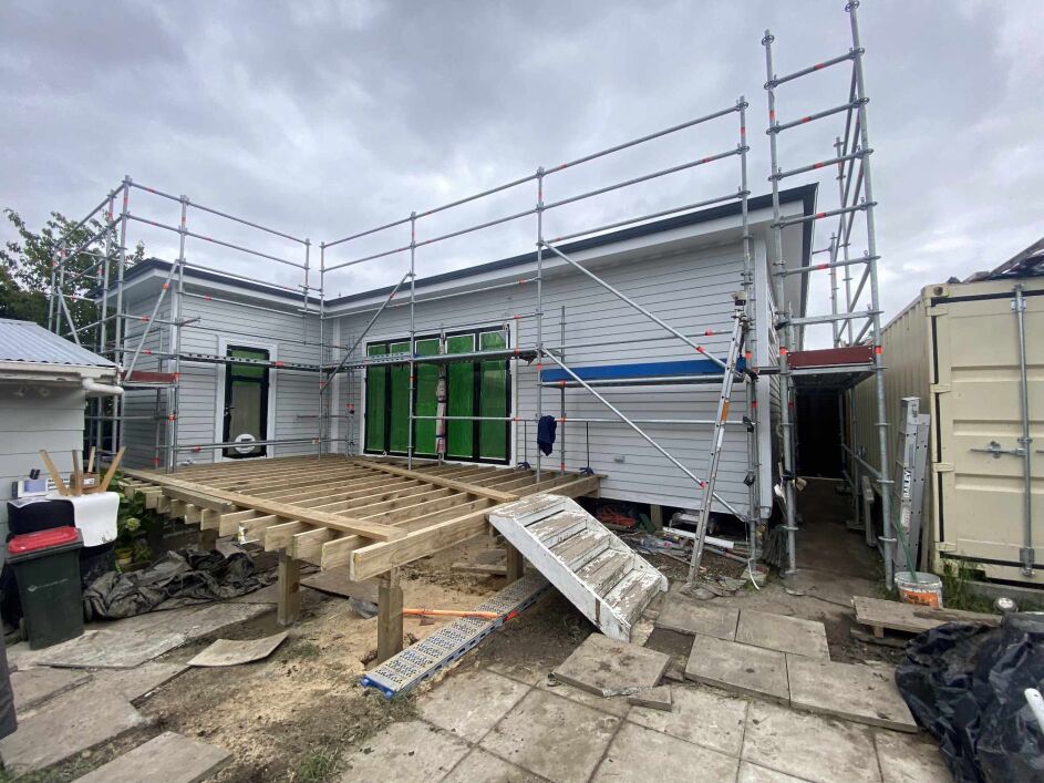
The exterior of the extension has cladding and joinery installed. The roofing and guttering are also installed. You can also see the new deck taking shape. So much progress. And here she is below!
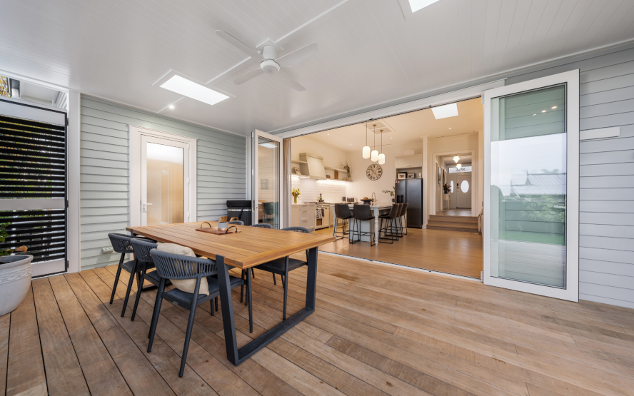
The new covered deck with ideal indoor-outdoor flow
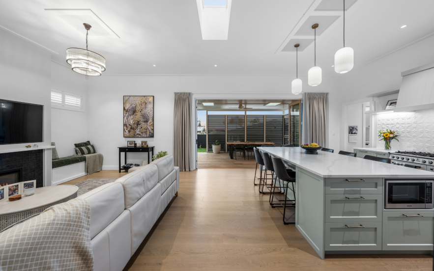
Beautiful new kitchen/dining/lounge
 Here you can see how all that hard work has been worth it. Think back to that disconnected, pokey, dark kitchen all boxed off and compare it to this light-filled, connected social hub with ample storage and work surfaces. So perfect for everyday family life.
The custom kitchen
The kitchen was designed and created with the clients by Marton Lee Kitchens. They also manufactured this custom-designed range hood cover to hide the extractor more elegantly. The colour of the cabinetry is Quarter Robin Egg by Karen Walker, perfectly matched by Marton Lee.
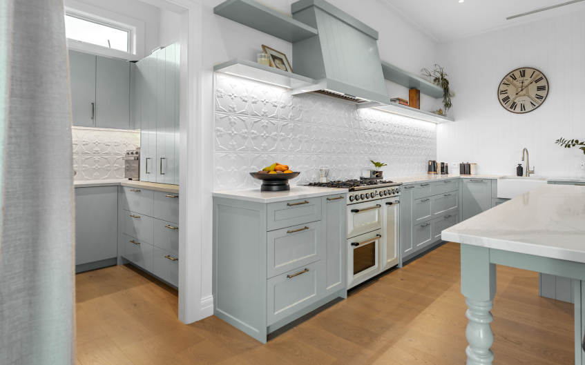
Pressed tin was selected for the backsplash from Stamp Pressed Metal to add a touch of character to the kitchen/butlers, and laundry. Pressed tin is coated just like aluminium joinery, so very hardy and easy to wipe clean.
With an option to customise the colour of your tin for an additional charge. Pressed tin comes in sheets and has no grout lines, unlike tiles and is much more forgiving than glass, with a super-fast installation.
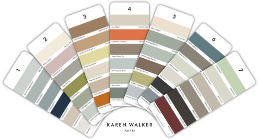

The paint colours throughout the home were chosen from the Resene Karen Walker palette; these are available in test pots for you to try, which is so helpful.
As they are part of the same family, they naturally complement each other, removing the stress of selecting tonal colours that work cohesively. Duck Egg Blue and Robin Egg Blue have scored very highly, as mentioned here in the latest Resene Colour Article
Cosy new lounge room with a feature fireplace
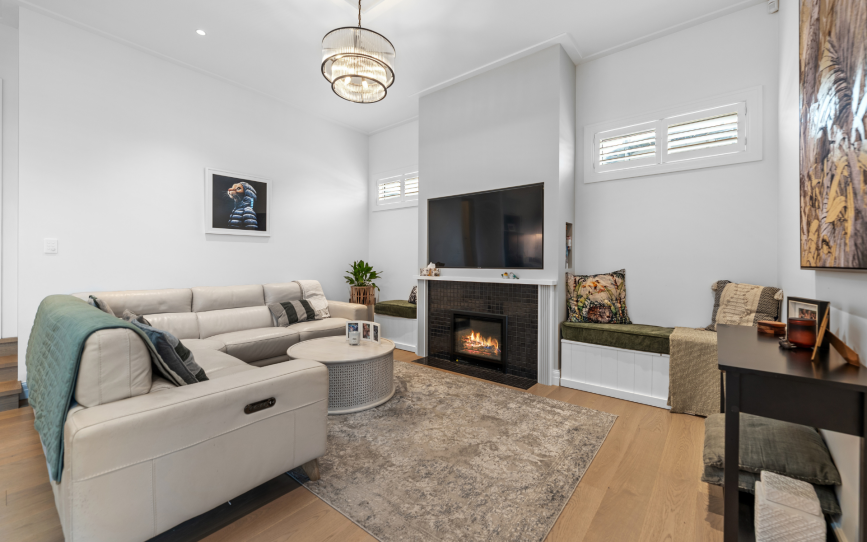
A feature fire was installed in the cosy lounge room to add a nice anchor and ambience. Built-in seats around the fireplace make it cosy and inclusive for social gatherings.
Why This Kitchen–Dining–Lounge Space Works So Well
A True Open-Plan Heart of the Home - The kitchen, dining, and lounge all share one generous space — but each zone still feels defined. This creates a warm, connected family hub without feeling cluttered or chaotic.
Beautiful Flow From Indoors to Outdoors - The large sliders open the dining area straight onto the covered deck. It turns everyday meals into something special and makes entertaining effortless.
Light That Lifts the Entire Space - Skylights, large doors, and soft pendant lighting work together to create a bright, uplifting atmosphere from morning through to evening.
A Kitchen Island Designed for Real Living - That long, generous island is both a practical workspace and an inviting gathering spot. Kids, guests, or family can sit, snack, chat, or help — without getting in the cook’s way.
Soft Green Cabinetry Adds Calm Character - The muted sage tone brings warmth and personality while still feeling timeless. It’s subtle, stylish, and gently ties into the natural tones of the dining and outdoor area.
A Lounge That Feels Cosy, Not Cut Off - The fireplace nook and built-in bench make the lounge feel snug and intimate, yet still connected enough for conversation across the space.
Consistent Flooring = Seamless, Spacious Feel - The warm timber flooring visually pulls the entire room together, making the space feel larger and more cohesive.
Thoughtful Layered Lighting - Pendants in the kitchen, a statement chandelier in the lounge, and ambient architectural lighting ensure the space feels inviting day and night — bright when needed, moody when wanted.
A Palette That Feels Soft, Warm, and Homely - The blend of creams, soft greens, warm wood, and gentle textures keeps the whole space calm and welcoming, without sacrificing style.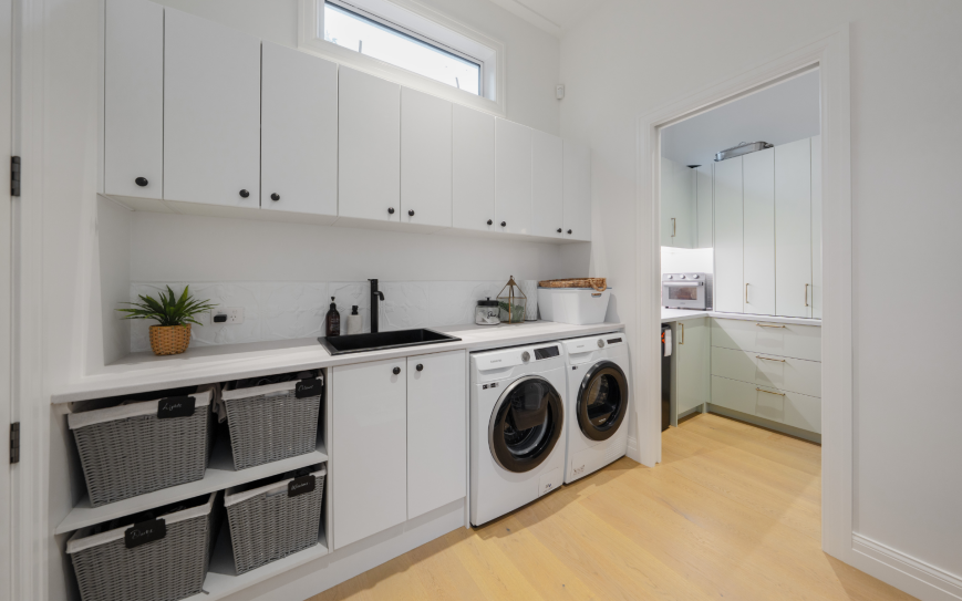
There is also a generous butler's pantry and laundry to the rear of the kitchen. Restorative Painters did an incredible job both inside and out; they come highly recommended.
Skylights have been cleverly placed in the main bathroom to bring in natural light and in the extension hallway to allow more light into the lounge/kitchen and dining spaces.
With feature boxing around the pendants over the kitchen island to create interest on an otherwise flat ceiling. All of these subtle choices breathe character into the home.
The main extension also allowed for a much larger, more social kitchen/dining and lounge area to flow seamlessly onto the covered deck.
The old bathroom & awful porch toilet
This was one of the 'bathrooms' on offer when the home was purchased. Not a feature image for the sales brochure, that's for sure.
Teeny tiny and directly across from the front door. With a gorgeous, vinyl curtain for 'privacy'.
No toilet, and a shower with no lining in it. There was hardly room to wash a cat, let alone swing one.
The bathroom off the porch wasn't much better, cold and exposed with concrete flooring, it felt more like a very basic bach than a home.
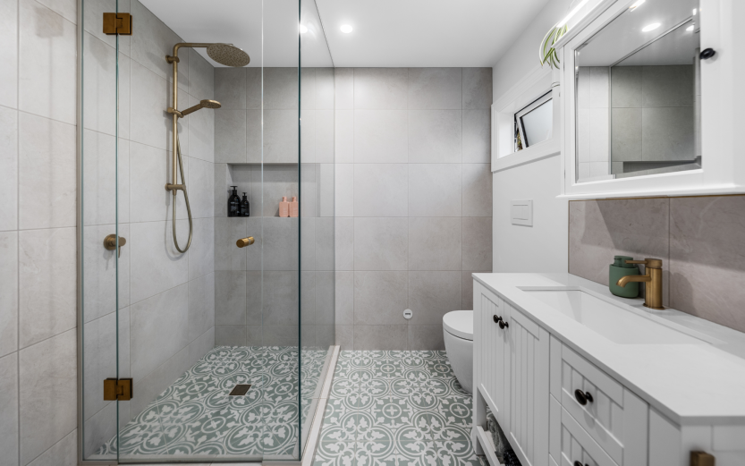
What Makes The New Bathroom So Great?
The new bathroom below is a perfect example of how thoughtful design can completely elevate a space without feeling overdone. It blends practicality with personality, creating a room that feels serene, functional, and beautifully cohesive.
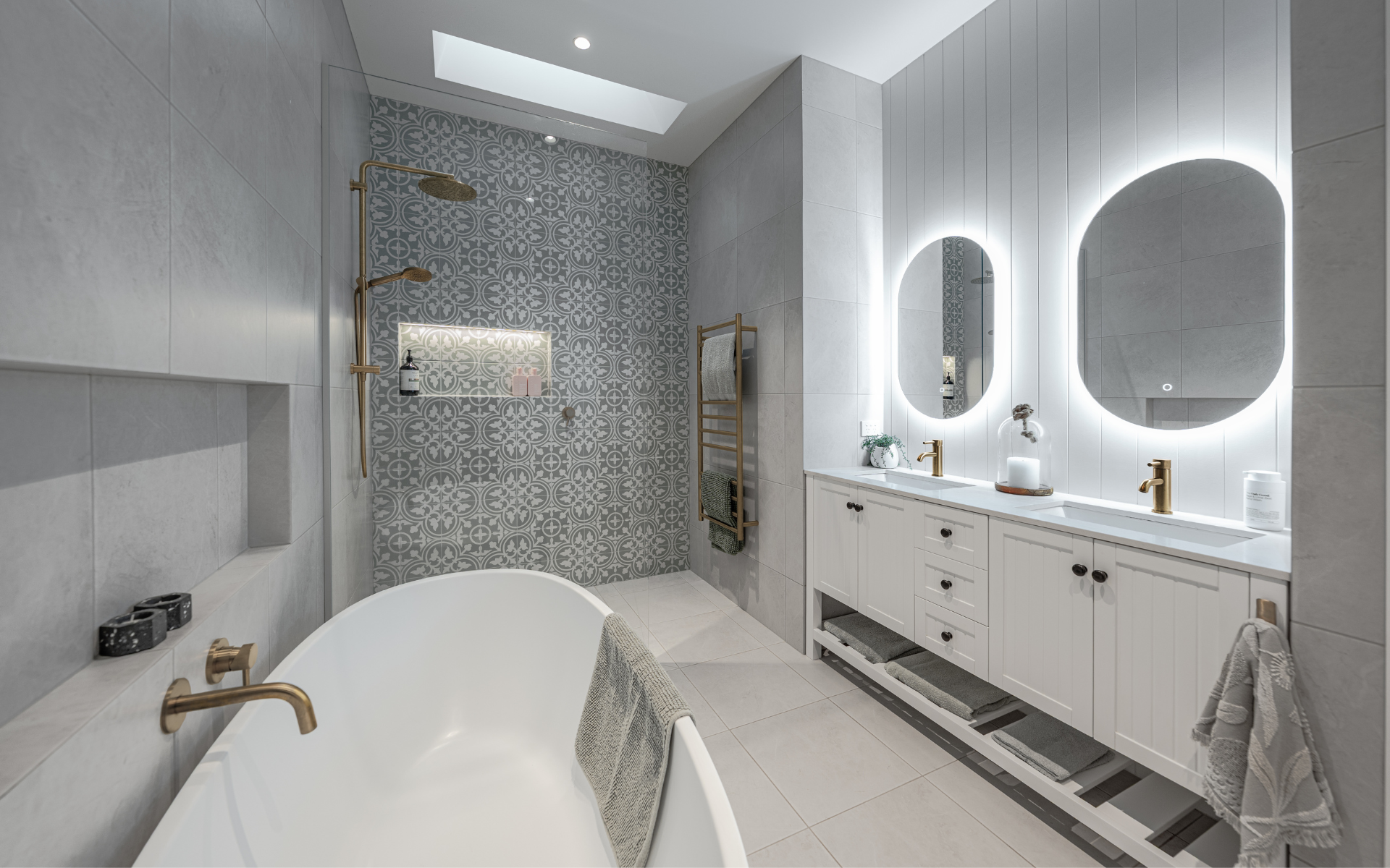
A Statement Wall That Adds Personality (Without Overwhelming the Space) - The patterned feature tiles in the shower instantly draw the eye and give the room character. Because only one wall is tiled this way, it adds interest without blowing the budget or making the room feel busy.
Soft, Calming Neutrals Everywhere Else - The surrounding light grey tiles and soft colour palette help balance the feature wall. They keep the space feeling open, airy, and spa-like — especially when combined with the skylight above the shower.
Brass Fixtures That Add Warmth and Luxury - Brushed brass taps, shower fittings, and towel rail introduce warmth and contrast. They elevate the look without being flashy, and they tie the whole scheme together beautifully.
Clever Use of Lighting - The backlit mirrors are a standout feature. They create soft, flattering lighting — perfect for everyday use — while adding a modern touch that doesn’t clash with the room’s classic elements.
The Freestanding Bath as a Calm, Sculptural Moment - The simple, elegant shape of the bath adds a calming focal point. Positioned away from the patterned tiles, it helps maintain visual balance.
Storage That Actually Works - From the recessed shower niche and floor-to-ceiling cupboard to the double vanity and open shelf underneath, every bit of storage is functional and thoughtfully placed. Nothing feels cluttered.
A Gorgeous Mix of Classic + Contemporary - The vanity introduces a subtle, classic feel with its panelled doors, while the lighting, hardware, and tile choices keep everything feeling fresh and current. It’s a timeless combination that won’t date quickly.
The new parental retreat - incl en-suite and walk-in robe
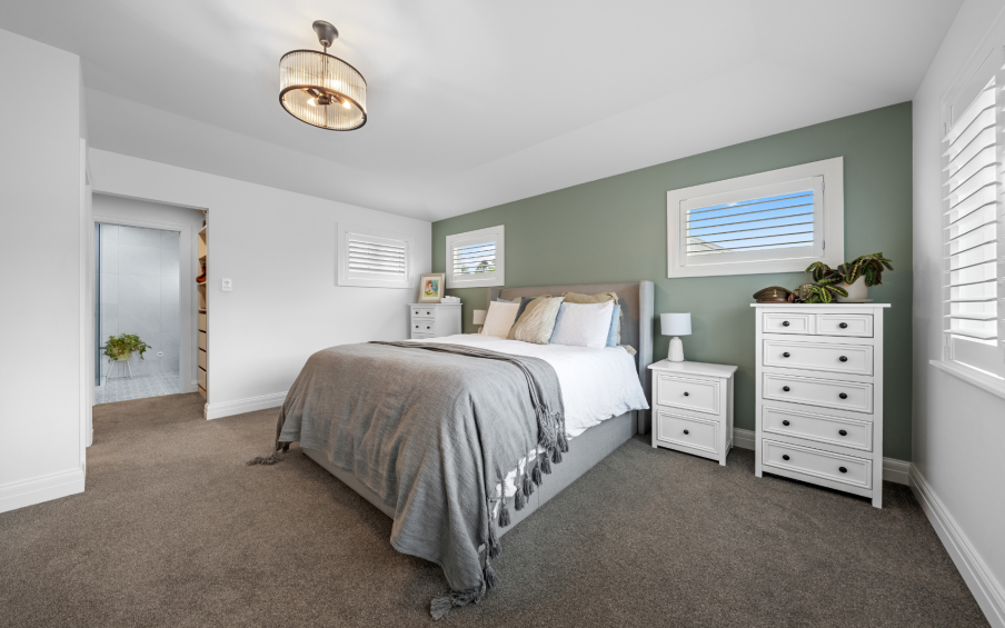
This is the repurposed 70's split-level lounge area. Now, a peaceful escape for parents of 3. A small but life-changing extension was added to this area to provide the extra floor space for the en-suite and walk-in robe. A very welcome addition.
New re-purposed master bedroom and gorgeous new en-suite connected by colours, tiles and fittings.
How did they restore heritage details in the home?
All ceilings were restored to the original stud heights, creating a lovely, light, lofty feeling throughout the home. Ceiling battens were recreated to replicate those that were sadly damaged beyond repair.
Grooved panelling graces the walls in the hallway, WC and bathroom. The panelling is also echoed on a feature kitchen wall and the base of the kitchen island. Creating a cohesion of spaces.
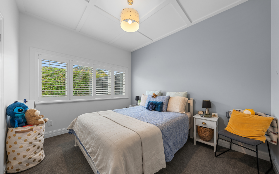
The right front bedroom originally had a set of French doors, which were replaced to allow better safety and symmetry to the home. The architraves around the windows were also re-trimmed to create a more characterful profile. One that the 1930s home would originally have had.
The front apex (gable end) was also restored to a more traditional style. Removing the ribbed panel and skinny metal poles added in the 70s, and replacing them with routered, chunky posts and a battened front. Which you can see in the image below.
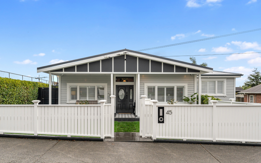
Removing the ramp, flattening and tiling the front porch has created a wonderfully welcoming approach. A new front door and panel with a window above to allow more light into a once dark hallway has been thoughtfully embellished with its street number. A beautiful new fence was also added to frame the front and provide gorgeous curb appeal.
This home has been a true labour of love for its owners — a thoughtful restoration that has brought its heritage, beauty, and soul back to life.
"We love living in our renovated home. It’s so much lighter & connected, it’s
perfect for our family!" Paul & Kate - Homeowners...
 The family is deeply proud of what their home has become, and the Gold Master Builders Award it earned is a testament to the craftsmanship, care, and expertise poured into every detail. See the MB article here
When you choose Alpha 1 Builders, you’re choosing a team that understands the responsibility of renovating a character home. We respect its history, honour its architectural charm, and know how to seamlessly blend old-world craftsmanship with modern comfort.
Most importantly, they treat your home with the same dedication and pride as if it were their own.
If you’re ready to breathe new life into your character home — and want a partner who truly cares — Alpha 1 Builders is here to bring your vision to life. Get in touch
Craftsmanship that wins awards - Renovations that respect your budget.